Design Systems for Scalable Applications
Fluxline Resonance Group
Published: December 4, 2025
Explore how design systems enable consistency, efficiency, and scalability in modern application development.
Design Systems for Scalable Applications
A well-designed design system is the foundation of scalable, maintainable, and consistent applications. This article explores the principles and practices for creating effective design systems.
What is a Design System?
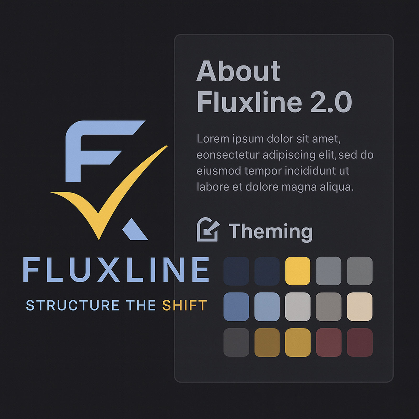
A design system (or DSM) is a toolkit of reusable parts and clear rules that help teams build applications faster and more consistently. It’s not just about components—it’s about creating a shared language between design and development.
Core Building Blocks
Design Tokens → The basics: colors, fonts, spacing, shadows, etc.
Component Library → Ready-to-use UI pieces like buttons, forms, and modals.
Patterns → Common layouts and interaction flows that solve recurring problems
Guidelines → Documentation that explains when and how to use components.
Tools → Design software, code libraries, and docs that keep everything connected.
Why Design Systems Matter
Consistency → A unified look and feel across every product and platform
Efficiency → Build faster by reusing components instead of reinventing them
Scalability → Easy to grow, adapt, and maintain as your product, brand, or business evolves.
Collaboration → Designers and developers speak the same language.
Quality → Components are tested, refined, and reliable—raising the overall bar.
Key Takeaway
A design system isn’t just a library of buttons—it’s a living framework that scales with your product and your team. By investing in one, you create a foundation for speed, consistency, and long-term success.
Building a Design System
Step 1: Define Design Tokens
// Example: Design tokens configuration, including colors, layouts, breakpoints, typography, and so on.
export const designTokens = {
  colors: {
    primary: '#274470',
    secondary: '#50E6FF',
    background: '#FFFFFF',
    text: '#333333',
  },
  typography: {
    fontFamily: 'Inter, system-ui, sans-serif',
    fontSize: {
      small: '12px',
      medium: '14px',
      large: '20px',
    },
  },
  spacing: {
    xs: '4px',
    sm: '8px',
    md: '16px',
    lg: '24px',
    xl: '32px',
  },
};
Step 2: Create Component Library
Build reusable components that implement your design tokens:
Buttons
Forms
Cards
Navigation
Modals
Data tables
Step 3: Document Everything
Clear documentation is crucial for adoption:
Component API documentation
Usage examples and best practices
Accessibility guidelines
Design principles
Step 4: Implement Versioning
Use semantic versioning to manage changes and updates to your design system.
Integration with Fluent UI
At Fluxline, we leverage Fluent UI as the foundation for our design system, extending it with custom themes and components:
// Example of using the design system with React hooks and JSX to create a button component
import { useAppTheme } from '@/theme/hooks/useAppTheme';

export function ThemedButton() {
  const { theme } = useAppTheme();

  return (
    <button
      style={{
        backgroundColor: theme.palette.themePrimary,
        color: theme.palette.white,
        padding: theme.spacing.m,
        borderRadius: theme.effects.roundedCorner2,
      }}
    >
      Click Me
    </button>
  );
}
Best Practices
Start Small: Begin with foundational elements and components, then expand gradually
Design for Accessibility: Build accessibility in from the start
Maintain Flexibility: Allow customization while maintaining consistency
Iterate Based on Feedback: Continuously improve based on user needs
Automate Testing: Ensure components work across all scenarios
Challenges and Solutions
Adoption: Provide excellent documentation and examples
Maintenance: Dedicate resources to ongoing support
Evolution: Balance stability with innovation
Customization: Allow theming and configuration
Conclusion
A well-implemented design system is an investment that pays dividends in consistency, efficiency, and scalability. By following best practices and continuously iterating, you can create a design system that empowers your teams and delights your users.
Let's Connect
→ Book a session with us
→ Explore more about the Fluxline philosophy
Related Resources
Fluxline Glyph System Portfolio — Symbolic design language as part of design system
Symbolic Design & Glyph Language Case Study — How visual language creates brand differentiation
Fluxline 2.0 Platform Development — Real-world design system implementation
Fluxline Design System 1.0 Released — Official component library announcement