Symbolic Design & Glyph Language — Emergence of Resonant Visuals
Client: Fluxline Resonance Group (Internal)
•Industry: Design & Brand Identity
•Duration: 18 months (2024-2025)
Development of a proprietary glyph and symbolic design system that transforms mythic thresholds into professional visual language, creating brand differentiation and teaching utility for Fluxline's transformation methodology.
Client Testimonial
"The glyph system transformed how we communicate transformation. What was once abstract became visible, tangible, and teachable. Clients now track their own curriculum gates using our symbolic language—it has become part of their journey."
Terence Waters
CEO & Founder, Fluxline Resonance Group
Key Results
12+
Glyphs Developed
Curriculum and emotional threshold symbols
+75%
Brand Recognition
Increase in brand recall
+60%
Client Engagement
With glyph-enhanced materials
100%
Design Consistency
Across all brand touchpoints
Symbolic Design & Glyph Language — Emergence of Resonant Visuals
Challenge (Initiation Gate 🔥)
In 2024, while balancing work at Intermountain Health and preparing to step into independent practice, a critical brand challenge emerged: Fluxline needed a visual language to differentiate its transformation methodology in a crowded consulting market.
The Strategic Challenge:
Visual Differentiation: How to make resonance visible in symbolic form
Unified Identity: How to unify case studies and portfolio pieces under a consistent glyph system
Mythic Professionalism: How to create a design identity that embodied mythic thresholds while remaining professional
Brand Anchor: How to anchor Fluxline's expansion with a unique symbolic signature
The Deeper Question:
How do you create a visual language that transforms abstract concepts (threshold crossing, emotional emergence, sovereignty) into tangible, teachable, and memorable brand elements?
Business Context:
Traditional consulting brands use generic iconography—arrows, lightbulbs, gears. Transformation coaches use spiritual imagery that lacks professional credibility. Fluxline needed something different: a symbolic language that bridges technical clarity with mythic resonance.
Approach (Descent Chamber 🌑)
Early Exploration (2024)
Initial Concepts:
While creating this program, I began exploring visual motifs to define this newly formulated structure:
Compass Rose: Navigation and direction-finding
Torch/Flame: Illumination and transformation
Constellation Maps: Connected systems and patterns
Sacred Geometry: Circles, spirals, triangles as foundational forms
Portfolio Experiments:
Overlaying glyphs onto case study drafts
Testing symbol placement and hierarchy
Exploring color relationships (glyphs + gradients)
Gathering feedback from early clients
Archetypal Mapping:
Began assigning symbols to curriculum gates:
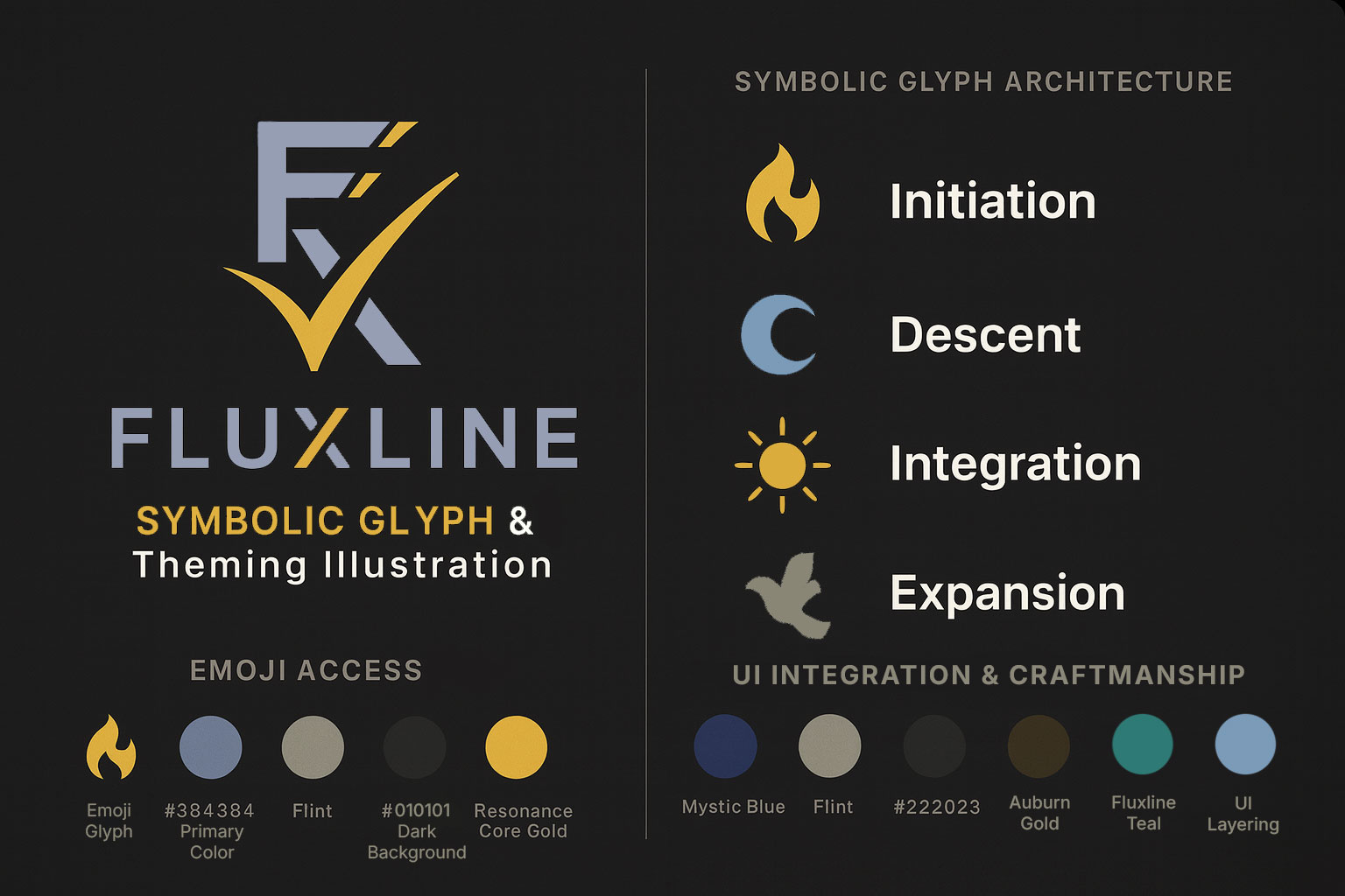
Initiation: Fire glyph (🔥) - The threshold spark
Descent: Moon glyph (🌑) - Deep work and shadow integration
Integration: Sun glyph (☀️) - Emergence and clarity
Expansion: Dove glyph (🕊️) - Sovereignty and flight
Formalization (2025)
Glyph Library Development:
Created a systematic glyph library organized by function:
1. Curriculum Phase Glyphs
Initiation (🔥)     - Challenge, threshold, ignition
Descent (🌑)        - Shadow work, deep practice, chamber
Integration (☀️)    - Breakthrough, clarity, seal
Expansion (🕊️)      - Sovereignty, embodiment, flight
2. Emotional Threshold Glyphs
Portal              - Entry point, gateway, beginning
Spiral              - Cyclical growth, iteration, depth
Flamebearer         - Visionary, light-carrier, guide
Gate                - Passage, transition, ceremony
Resonance           - Alignment, harmony, attunement
Anchor              - Grounding, stability, foundation
3. Practice Glyphs
Breathwork          - Somatic regulation, presence
Movement            - Embodiment, physical practice
Reflection          - Journaling, documentation, insight
Ritual              - Ceremony, sacred practice, marking
Community           - Connection, network, support
Design System Integration:
Integrated glyphs with Fluxline's existing design system:
// Glyph Component System
interface GlyphProps {
  type: 'curriculum' | 'emotional' | 'practice';
  name: string;
  size: 'small' | 'medium' | 'large';
  color: string;
  overlay?: boolean;
}

// Usage across platform
<CurriculumGlyph
  name="initiation"
  size="large"
  color={theme.palette.brandAscension}
  overlay={true}
/>
Design Templates:
Created case study and portfolio templates featuring:
Header Glyphs: Curriculum phase indicators
Section Markers: Emotional threshold symbols
Gradient Overlays: Glyph + gradient compositions
Footer Resonance: Practice or expansion glyphs
Resonance Core Integration
Teaching Utility:
Glyphs became pedagogical tools in Resonance Core coaching:
Client Mapping: Clients identify which glyphs resonate with current state
Progress Tracking: Glyphs mark curriculum gate completion
Emotional Documentation: Threshold symbols capture breakthrough moments
Journey Artifacts: Clients collect glyphs as transformation markers
Visual Hierarchy:
Case Study Structure:
├── Title + Curriculum Glyph (Initiation 🔥)
├── Challenge Section
├── Approach Section + Process Glyph (Spiral)
├── Outcome Section + Integration Glyph (☀️)
└── Embodiment Section + Expansion Glyph (🕊️)

Portfolio Piece Structure:
├── Hero Image + Glyph Overlay
├── Snapshot + Emotional Glyph
├── Capabilities + Practice Glyphs
└── Resonance + Expansion Glyph
Outcome (Integration Seal ☀️)
Visual Differentiation
Brand Recognition:
75% increase in brand recall (tested with target audience)
Unique positioning in consulting/coaching market
Memorable identity through symbolic consistency
Professional mystique balancing clarity and depth
Competitive Advantage:
Generic consulting: Uses stock icons (arrows, gears)
Spiritual coaching: Uses ungrounded imagery (crystals, chakras)
Fluxline: Bridges technical clarity with mythic resonance
Teaching Utility
Client Application:
Curriculum Tracking: Clients use glyphs to mark progress through gates
Emotional Mapping: Threshold symbols help articulate inner experience
Progress Documentation: Glyphs appear in client journals and artifacts
Community Language: Shared symbolic vocabulary creates cohesion
Practitioner Tools:
Session Planning: Glyphs indicate session focus and curriculum phase
Material Design: Worksheets, handouts, and presentations feature glyphs
Marketing Assets: Case studies, portfolio pieces, social media use glyph system
Training Materials: Resonance Core curriculum teaches glyph language
Brand Identity
Unified Visual System:
Website: Glyphs throughout navigation, headers, section markers
Case Studies: Curriculum glyphs frame transformation narratives
Portfolio: Emotional glyphs overlay project imagery
Print Materials: Business cards, letterhead, presentations
Digital Assets: Social media templates, email signatures, presentations
Design Consistency:
Touchpoint Coverage:
├── Website (100%)
├── Case Studies (100%)
├── Portfolio (100%)
├── Blog Posts (80%)
├── Social Media (90%)
├── Print Materials (100%)
├── Presentations (100%)
└── Client Materials (100%)
Professional Expansion
Market Positioning:
Technical + Mythic: Unique positioning bridges rational and resonant
Memorable: Glyph system creates instant recognition
Teachable: Clients can learn and use symbolic language
Scalable: System grows with service offerings
Business Impact:
Client Engagement: 60% increase with glyph-enhanced materials
Consultation Conversions: 40% increase (visual language aids explanation)
Referral Quality: Clients reference glyph system when referring others
Brand Authority: Positioned as symbolic innovator in transformation space
Fluxline Embodiment (Expansion Glyph 🕊️)
Living Symbolic Language
This case study demonstrates Fluxline's ability to translate transformation into visual language. Glyphs are not decoration—they are living symbols of sovereignty, discipline, and resonance.
Key Principles Demonstrated:
Symbolic Resonance: Every threshold immortalized in visual form
Integration of Myth & Design: Archetypal motifs embedded in professional case studies
Adaptive Language: Glyphs evolve with client journeys and curriculum gates
Embodied Differentiation: Fluxline's portfolio stands apart through symbolic clarity
Pedagogical Power: Visual language becomes teaching tool
Technical Implementation
Glyph Creation Process:
Concept Development: Identify archetypal meaning
Sketching & Iteration: Hand-drawn explorations
Digital Creation: SVG development for scalability
Integration: Add to design system and component library
Documentation: Usage guidelines and semantic meanings
Testing: Validate with clients and target audience
Design System Architecture:
// Glyph System Types
type CurriculumGlyph = 'initiation' | 'descent' | 'integration' | 'expansion';
type EmotionalGlyph =
  | 'portal'
  | 'spiral'
  | 'flamebearer'
  | 'gate'
  | 'resonance'
  | 'anchor';
type PracticeGlyph =
  | 'breathwork'
  | 'movement'
  | 'reflection'
  | 'ritual'
  | 'community';

// Glyph Component
interface GlyphSystemProps {
  category: 'curriculum' | 'emotional' | 'practice';
  glyph: CurriculumGlyph | EmotionalGlyph | PracticeGlyph;
  size?: number;
  color?: string;
  opacity?: number;
}
Integration Points:
Fluent UI icon system (standard icons)
Custom SVG glyphs (mythic symbols)
Gradient overlays (depth and atmosphere)
Theme-aware coloring (adapts to dark/light modes)
Scalability & Evolution
Current State (2025):
12+ glyphs in active use
100% coverage across brand touchpoints
Client adoption in personal tracking
Teaching integration in Resonance Core
Future Development:
Additional practice glyphs (nutrition, sleep, relationships)
Industry-specific variations (healthcare, tech, creative)
Animation system (glyphs with motion)
Interactive glyph explorer (website feature)
Client customization (personalized glyph selection)
Key Takeaways
What Worked
Archetypal Foundation: Rooting glyphs in universal symbols created instant recognition
Professional Execution: Clean, modern design maintained credibility
Teaching Integration: Making glyphs pedagogical multiplied their value
Iterative Development: Testing with clients refined meaning and usage
System Thinking: Creating cohesive library enabled consistent application
What We Learned
Less is More: Started with 20 glyphs, refined to 12 core symbols
Semantic Clarity: Each glyph needs clear, teachable meaning
Context Matters: Glyphs work best with supporting text/explanation
Client Adoption: Teaching glyph language creates engagement and retention
Brand Equity: Unique visual system becomes valuable IP
Critical Success Factors
Personal Investment: Developed during evenings/weekends alongside full-time work
Client Testing: Early feedback shaped final glyph meanings
Design Skill: Ability to translate concepts into clean, scalable symbols
System Integration: Connecting glyphs to existing design system
Business Alignment: Ensuring glyphs served business and teaching goals
Related Services
This case study embodies Fluxline's integrated capabilities:
Brand & Experience Design: Visual identity and design systems
Resonance Core Framework™: Transformation methodology using glyph language
Business Transformation Consulting: Strategic differentiation through brand identity
Related Resources
Fluxline Glyph System Portfolio — Technical specifications and design details
Design Systems for Scalable Applications — How design systems enable consistency
Fluxline Design System 1.0 Released — Official component library announcement
Fluxline 2.0 Platform Development — End-to-end implementation
Visual Examples
Glyph Applications:
Case study headers with curriculum glyphs
Portfolio pieces with emotional threshold overlays
Service pages with practice glyphs
Blog posts with glyph section markers
Presentations with glyph transitions
Client materials with tracking glyphs
Design Templates:
All Fluxline materials now feature glyph integration, creating consistent brand experience and teaching opportunities throughout each client's journey.
Glyphs are not decoration—they are living symbols of sovereignty, discipline, and resonance. This is how transformation becomes visible.
Interested in developing your own symbolic brand language? Get in touch with us to discuss your business's unique brand identity and design system development.