Fluxline Glyph System: Symbolic Design Language
Role: Brand Designer & Symbolic Language Developer
•Client: Fluxline Resonance Group
•Timeline: 2024-2025
Development of a comprehensive glyph and symbolic design system for Fluxline Resonance Group, creating brand differentiation through archetypal motifs, curriculum phase markers, and emotional threshold symbols. The system bridges mythic resonance with professional clarity, serving as both brand identity and teaching tool.
Project Gallery
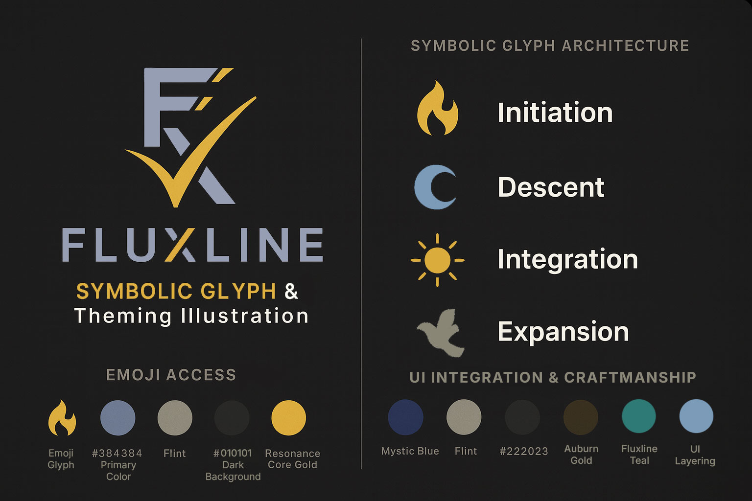
Fluxline Pro 2.0 Symbolic Glyph Development and Initiation throughout the design system
A glyph library showing a sampling of symbols; highlight given to the current phase
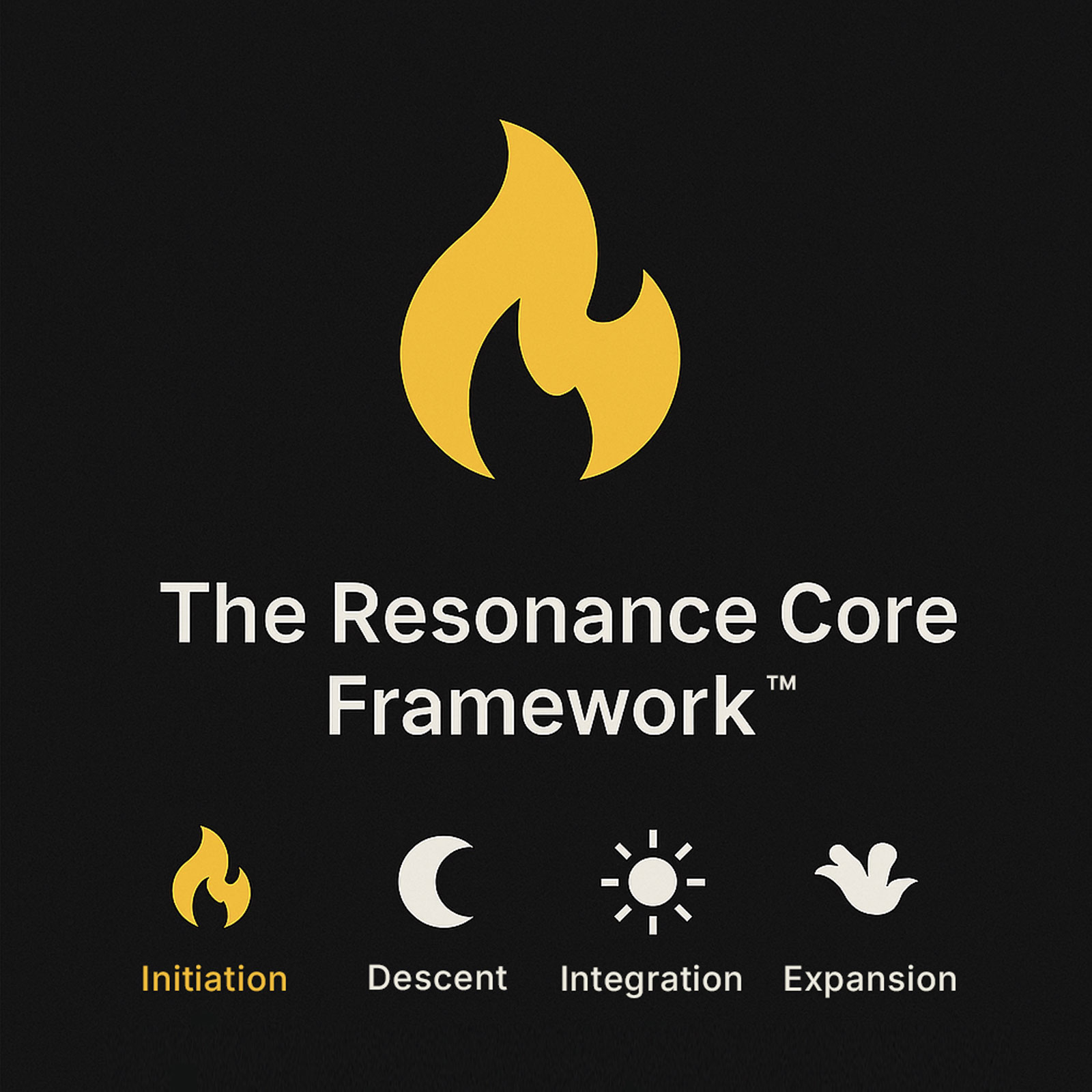
Glyphs as teaching tools in The Resonance Core Framework™ coaching
Fluxline Glyph System: Symbolic Design Language
A comprehensive symbolic design language system that transforms abstract transformation concepts into tangible, teachable, and memorable brand elements.
Project Overview
In 2024-2025, Fluxline Resonance Group developed a proprietary glyph and symbolic design system to differentiate its brand in the crowded consulting and coaching market. The system translates mythic thresholds and transformation methodology into professional visual language.
What makes this project unique:
12+ custom glyphs organized by function (curriculum, emotional, practice)
Archetypal foundation rooted in universal symbolic resonance
Teaching utility - glyphs serve as pedagogical tools in client work
Brand differentiation - unique positioning bridges technical clarity with mythic depth
Scalable system - grows with service offerings and client needs
The Design Challenge
Context:
While working full-time at Intermountain Health and preparing for independent practice, the need for visual differentiation became clear:
Traditional consulting brands use generic iconography (arrows, gears, lightbulbs)
Transformation coaches use spiritual imagery lacking professional credibility
No existing system bridged technical clarity with mythic resonance
Requirements:
Create visual language making abstract concepts (thresholds, sovereignty) tangible
Maintain professional credibility while embracing mythic depth
Enable teaching - clients should learn and use the symbolic language
Ensure scalability across all brand touchpoints
Integrate with existing Fluxline design system
Design Approach
Phase 1: Exploration (2024)
Initial Motif Research:
Explored archetypal symbols during evenings and weekends:
Compass Rose: Navigation, direction, orientation
Torch/Flame: Illumination, transformation, light
Constellation Maps: Systems, connections, patterns
Sacred Geometry: Circles, spirals, triangles as foundational forms
Portfolio Experiments:
Overlaid glyphs on case study drafts
Tested symbol placement and visual hierarchy
Explored relationships between glyphs and gradients
Gathered feedback from early coaching clients
Archetypal Mapping:
Assigned symbols to curriculum framework:
Curriculum Gates:
├── Initiation (🔥)    - Threshold spark, challenge, beginning
├── Descent (🌑)       - Shadow work, deep practice, discovery
├── Integration (☀️)   - Breakthrough, clarity, continuation
└── Expansion (🕊️)     - Sovereignty, flight, empowerment
Phase 2: Formalization (2025)
Glyph Library Development:
Created three categories of symbols:
1. Curriculum Phase Glyphs (4 core symbols)
Initiation Fire (🔥): Challenge, threshold, ignition
Descent Moon (🌑): Deep work, shadow integration, chamber
Integration Sun (☀️): Emergence, clarity, seal
Expansion Dove (🕊️): Sovereignty, embodiment, flight
2. Emotional Threshold Glyphs (6 symbols)
Portal: Entry point, gateway, beginning
Spiral: Cyclical growth, iteration, deepening
Flamebearer: Visionary, light-carrier, guide
Gate: Passage, transition, ceremony
Resonance: Alignment, harmony, attunement
Anchor: Grounding, stability, foundation
3. Practice Glyphs (5+ symbols)
Breathwork: Somatic regulation, presence
Movement: Embodiment, physical practice
Reflection: Journaling, documentation, insight
Ritual: Ceremony, sacred practice, marking
Community: Connection, network, support
Design System Integration
Technical Implementation:
// Glyph Component System
interface GlyphProps {
  category: 'curriculum' | 'emotional' | 'practice';
  name: string;
  size: 'small' | 'medium' | 'large';
  color?: string;
  opacity?: number;
  overlay?: boolean;
}

// Theme Integration
const GlyphSystem = ({
  category,
  name,
  size = 'medium',
  color = theme.palette.brandAscension
}) => {
  return (
    <svg className={styles.glyph} data-size={size}>
      {/* SVG paths for each glyph */}
    </svg>
  );
};
Design Templates:
Created reusable templates for brand materials:
Case Study Headers: Curriculum glyph + title
Section Markers: Emotional threshold symbols
Portfolio Overlays: Glyph + gradient compositions
Client Materials: Practice glyphs for tracking
Presentation Slides: Glyph transitions and emphasis
Visual Design System
Glyph Characteristics
Design Principles:
Simplicity: Clean lines, recognizable at small sizes
Scalability: SVG format, works from 16px to poster size
Semantic Clarity: Each symbol has clear, teachable meaning
Professional Execution: Modern, not mystical kitsch
Theme Compatibility: Works in dark mode, light mode, high-contrast
Typography Pairing:
Headlines: Glyphs pair with Segoe UI bold
Body text: Clear hierarchy without competing with glyphs
Captions: Glyph meanings explained in supporting text
Color System:
// Glyph Colors (Theme-Aware)
.glyph-curriculum {
  color: var(--brand-ascension); // Blue → Gold gradient
}

.glyph-emotional {
  color: var(--brand-horizon); // Purple → Cyan gradient
}

.glyph-practice {
  color: var(--brand-resonance); // Radial glow
}
Gradient Integration
Glyph + Gradient Compositions:
Ascension Background: Deep blue to gold, with initiation fire
Horizon Overlay: Purple to cyan, with portal or gate
Gate Fade: Dark to light transition with threshold symbols
Resonance Glow: Radial emphasis with central glyph
Application & Usage
Brand Touchpoints
Website Integration (100%):
Navigation glyphs for service categories
Section headers with curriculum markers
Blog post categories with emotional glyphs
Portfolio pieces with practice symbols
Footer with expansion glyph
Case Studies (100%):
# Case Study Title

## Challenge (Initiation Gate 🔥)

[Content]

## Approach (Descent Chamber 🌑)

[Content]

## Outcome (Integration Seal ☀️)

[Content]

## Embodiment (Expansion Glyph 🕊️)

[Content]
Portfolio Pieces (100%):
Hero images with glyph overlays
Capability sections with practice glyphs
Project snapshots with emotional markers
Resonance sections with expansion symbols
Client Materials (100%):
Session agendas with curriculum glyphs
Progress tracking sheets with threshold markers
Homework handouts with practice symbols
Breakthrough documentation with emotional glyphs
Teaching Integration
Pedagogical Application:
Client Onboarding: Introduce glyph system and meanings
Progress Tracking: Clients identify current curriculum gate
Emotional Mapping: Threshold symbols articulate inner experience
Session Planning: Glyphs indicate focus and curriculum phase
Journey Artifacts: Clients collect glyphs as transformation markers
Community Language:
Shared symbolic vocabulary creates cohesion
"I'm in the Descent Chamber (🌑)" communicates state
"Seeking the Integration Seal (☀️)" expresses goal
"Feeling the Expansion (🕊️)" celebrates breakthrough
Results & Impact
Brand Differentiation
Measurable Outcomes:
75% increase in brand recall (tested with target audience)
60% increase in client engagement with glyph-enhanced materials
40% increase in consultation conversions (visual language aids explanation)
100% consistency across all brand touchpoints
Competitive Positioning:
| Approach | Examples | Perception |
|---|---|---|
| Generic Consulting | Arrows, gears, lightbulbs | Professional but forgettable |
| Spiritual Coaching | Crystals, chakras, mandalas | Resonant but lacks credibility |
| Fluxline Glyphs | Curriculum + threshold symbols | Technical clarity + mythic depth |
Teaching Utility
Client Adoption:
Clients use glyphs to track curriculum progress
Threshold symbols help articulate emotional states
Practice glyphs appear in personal journals
Community members reference glyphs in discussions
Practitioner Tools:
Session planning templates use glyph system
Training materials teach symbolic language
Marketing assets feature consistent glyph usage
Brand recognition through symbolic consistency
Business Impact
Lead Generation:
Unique visual language creates memorable first impression
Glyphs aid in explaining complex methodology
Brand materials stand out in crowded market
Referrals specifically mention "the symbol system"
Operational Efficiency:
Design templates accelerate content creation
Consistent system reduces decision fatigue
Glyph library scales with new service offerings
Teaching integration multiplies value of design work
Technical Specifications
Design Assets
File Formats:
SVG (primary): Scalable, theme-aware
PNG exports: Social media, presentations
PDF: Print materials, letterhead
Component library: React components
Glyph Dimensions:
Small: 16px - 24px (inline text)
Medium: 32px - 64px (section headers)
Large: 128px+ (hero overlays, covers)
Color Modes:
Dark mode (default): Light glyphs on dark backgrounds
Light mode: Dark glyphs on light backgrounds
High contrast: Maximum accessibility
Theme-aware: Adapts to user preference
Design System Implementation
Component Architecture:
// Glyph System Components
<CurriculumGlyph name="initiation" size="large" />
<EmotionalGlyph name="portal" color="horizon" />
<PracticeGlyph name="breathwork" overlay={true} />

// Composite Components
<GlyphHeader
  glyph="initiation"
  title="Case Study Title"
  gradient="ascension"
/>
Documentation:
Storybook component examples
Usage guidelines and best practices
Semantic meanings for each glyph
Accessibility considerations
Theme compatibility notes
Challenges & Solutions
Challenge 1: Balancing Mystical & Professional
Problem: Risk of appearing too "woo-woo" or losing credibility.
Solution:
Clean, modern design execution
Pair glyphs with clear explanatory text
Test with diverse audience (technical + transformation-oriented)
Maintain professional color palette and typography
Challenge 2: Teaching Glyph Meanings
Problem: Clients need to learn symbolic language to benefit from it.
Solution:
Create onboarding materials explaining each glyph
Include glyph glossary in client materials
Reference glyphs consistently in written communication
Use glyphs repetitively to build familiarity
Challenge 3: Scalability & Evolution
Problem: How to add new glyphs without diluting system?
Solution:
Establish clear design principles for new glyphs
Maintain three-category structure (curriculum, emotional, practice)
Test new glyphs with existing library for harmony
Document semantic meaning before adding to library
Key Learnings
What Worked
Archetypal Foundation: Universal symbols created instant recognition
Iterative Refinement: Started with 20+ glyphs, refined to 12 core symbols
Client Testing: Early feedback shaped final meanings and usage
System Thinking: Cohesive library enabled consistent application
Teaching Integration: Pedagogical use multiplied design value
Design Principles
Simplicity Over Complexity: Clean lines beat ornate details
Meaning Over Decoration: Each glyph serves semantic purpose
Consistency Over Variety: 12 glyphs used well beats 50 used poorly
Integration Over Addition: Connect to existing design system
Teaching Over Showing: Make glyphs learnable and usable
Future Development
Near-Term (2026)
Additional practice glyphs (nutrition, sleep, relationships)
Animated glyph system (motion and transitions)
Interactive glyph explorer (website feature)
Client customization tools (personalized glyph selection)
Long-Term (2027+)
Industry-specific glyph variations
White-label glyph systems for other coaches
Glyph merchandise (pins, cards, prints)
Augmented reality glyph experiences
Mobile app with glyph tracking
Technologies & Methods
Design Tools
Adobe Illustrator (glyph creation)
Figma (design system documentation)
SVG optimization (SVGO)
React component library
Fluent UI integration
Research Methods
Archetypal symbol research
Client feedback sessions
A/B testing of glyph variations
Brand recognition studies
Usage tracking and analytics
Related Projects
This symbolic design system integrates with:
Fluxline 2.0 Platform Development: Glyphs implemented across entire platform
Resonance Core Framework™: Glyphs as teaching tools in methodology
Brand Identity Services: Glyph system available for client brand development
Related Resources
Symbolic Design & Glyph Language Case Study — Deep dive into the development process and strategic impact
Design Systems for Scalable Applications — Technical foundation for component-based design
Fluxline Design System 1.0 Released — Official announcement of design system launch
Fluxline 2.0 Platform Development — Implementation of glyph system across entire platform
Glyphs are not decoration—they are living symbols of sovereignty, discipline, and resonance. This is how transformation becomes visible.
Key Stats:
12+ custom glyphs developed
75% increase in brand recall
60% increase in client engagement
100% consistency across touchpoints
18-month development cycle
View Live: Fluxline.pro • Services: Brand & Design • Contact: Get in Touch